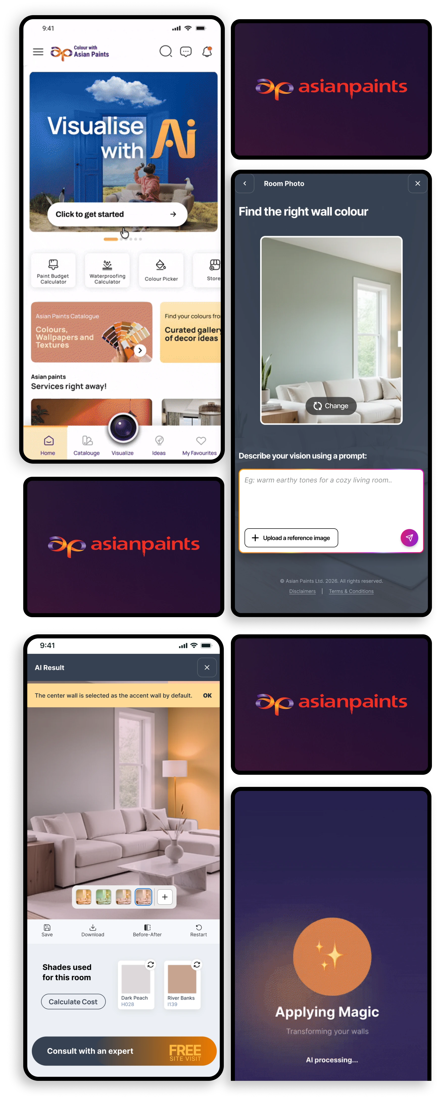
Its a digital visualisation app allowing over 5 million users to instantly view, select & visualise over 5000+ paint shades, textures & wallpapers on their own wall before painting. It also acts as a lead generation and engagement app for various products & services of Asian Paints.
The target group is of 5M + users ranging from 25 to 45+ years of age concentrated mostly in tier 1 & 2 Indian cities typically having mid to high tech literacy. It is focussed mainly towards those who are planning to repaint their homes.
Owned the journey end-to-end.
Requirements Research Product and design strategy Wireframes UI Validation Dev handover Hand off docs
I partnered with the team throughout the process, we had regular check-ins, to iterate quickly and ensure we were building something usable and aligned with the product vision. It was a fast moving team & we stayed tightly aligned from research & exploration through hand off.
The visualiser feature inside the Colour with Asian Paints (CWAP) app is a home visualisation tool that allows users to visualise how any paint/wallpaper/texture shades/styles of their choice would look like on their walls after application. This is also a lead generation tool to pitch home painting services offered by Asian Paints.
Lately lead generation showed a downward trend with increased drop off rate. My goal as a UI/UX designer was to redesign the tool to boost lead generation. (This is an ongoing project)
The challenge was to increase user satisfaction in the whole paint selection decision making process. Paint selection can be cumbersome.
If the journey to selecting paints/textures/wallpapers is smooth, it would automatically reduce drop off rates and increase lead generation.
One category of people decide a particular shade/style and then visit the app to visualise it ion their wall.
The other category of people visits the app without any particular shade/style of paint/texture in mind.
In either cases, arriving at a particular shade/style they like is a tedious process as colour catalogues offer vast choices & very often lead to decision paralysis resulting in drop offs.
People painting their home usually have many ideas and references in mind but struggle to execute them by selecting shades from catalogues. Also, visions in imagination real world outcomes. This causes disappointment.
Customers after deciding upon a shade would typically like to know how much would the painting cost be. But that journey was separate & quite long.
To help users choose paint shades that match their imagination and not get exhausted in the vast sea of 5000+ shades, AI in the visualiser would be the perfect tool!
The model is being trained on the complete catalogue of Asian Paint’s 5000+ paint shades, texture & wallpaper styles.
Provide a way for the customer to calculate the painting budget. This meaningful insight would further convince the customer to opt for painting services by providing relevant information to make an informed choice. Thus providing linking to the Paint Budget Calculator journey from the AI Visualiser result page has a high potential to boost leads generated.
The design philosophy revolved around effortless simplicity & faster decision making. Every interaction was crafted to minimise friction and guide users naturally through the paint shade selection process.
Once the user was satisfied with their result, lead generation CTAs could also be introduced strategically.
In the early stages, I explored different layout directions, to find the right balance between clarity and emphasis. The idea was to provide a prominent message to the users and design convenient entry points for them to access the AI visualiser. I decided to design a hero banner and place it at the top, along with the existing entry point from the bottom navigation.
A change button was included in the preview/prompt input page. This provided an easy out to the users to recover from the mistake of choosing the wrong image or incase they changed their minds.
The preview/input page contained two interaction points which allows the users to provide directions to the AI model. This was based on a few observations:
It is easier to describe an idea than looking for items that match this idea from a catalogue of 5000+ shades.
It is easier to describe this idea through visual references.
Expecting every user to realise the usefulness of a visual reference is a far fetch.
Thus, providing the option to upload a reference image in the same input field as the prompt, would not have the desired impact as it can be easily overlooked by users with lower tech literacy.
Hence, having a dedicated button upfront allowing them to upload a reference image was a more inclusive & universal design approach.
Processing the image with AI required time. It could take approximately little over a minute to generate the results. This could lead to potential drop offs in an otherwise simple and quick journey. To counter this issue, users were presented with two options:
Stay and wait for the result to appear.
Go to home and explore other features, get informed when result is ready.
A straight & simple result page was designed which showed the result image clearly with prominence and all the other information centring this result image making the design intuitive and having correct information hierarchy.
Communication is key! Result will be as good as the prompt communicated to the AI model. This Prompt is the Key
Since the model is unable to identify which colour has been used on which wall, changing a colour is not generating the expected result.